Keep Texans Talk Google Ad Free!
Venmo Tip Jar | Paypal Tip Jar
Thanks for your support! 🍺😎👍
You are using an out of date browser. It may not display this or other websites correctly.
You should upgrade or use an alternative browser.
You should upgrade or use an alternative browser.
Alternate Texans Logo
- Thread starter Andrew6
- Start date

Showtime100
Got JJ?
I really like it Andrew, seriously. I say it that way because I do have one criticism that really has nothing to do with the fine craftsmanship. Scary if you get a little superstitious like me...lol.
I think it's the tail, but it looks a little like Detroit's lion. Other than that, heck of a job, I like.
I think it's the tail, but it looks a little like Detroit's lion. Other than that, heck of a job, I like.
Andrew6
All Pro
I really like it Andrew, seriously. I say it that way because I do have one criticism that really has nothing to do with the fine craftsmanship. Scary if you get a little superstitious like me...lol.
I think it's the tail, but it looks a little like Detroit's lion. Other than that, heck of a job, I like.
hmmm... didn't pay much attention to that. I'll see what I can do.
Showtime100
Got JJ?
hmmm... didn't pay much attention to that. I'll see what I can do.
I might just be looking at it funny. Others opinions might differ greatly. Whatever you do keep that one before you alter.
")
Very cool, man! It makes the logo go from sort of an abstract feel to making sense with relation to body position. Good job! 
CloakNNNdagger
Hall of Fame
hmmm... didn't pay much attention to that. I'll see what I can do.
You might just try "shredding" the end of the tail.
drs23
Veteran
Looks like the Texans logo on an anteaters butt.
That Thorn. He can be so complimentary, can't he.

PS, I think it rocks!
I really like it. If I had any thing to critique I would say tone down the emboss effect a little.
Looks like the Texans logo on an anteaters butt.
okay... step AWAY from the eggnog...
Uncle Rico
Ur apology should be as loud as Ur disrespect was
ya'll remember in living color - men on film?
'haaaaated it' ... 3 snaps in a Z direction.
the body just kind of terrorizes the space. the simple current logo is a classic. it will remain for many years. our uni's in general are appealing and dont get tiring at all to look at or wear. who doesnt love red,white and blue seriously? it goes with eveything.
now the rockets? thats a whole different story.
Andrew6
All Pro
I like it. I just saw it on facebook too...we must know the same people or something.
I posted on Facebook, I'm William Anderson but go by Andrew
Andrew6
All Pro
did you really create that??

modified it to make it better, I like my version better.

Allstar
Bona fide
modified it to make it better, I like my version better.
So you just added the metallic effects? I was under the impression you created the whole design yourself...
Andrew6
All Pro
So you just added the metallic effects? I was under the impression you created the whole design yourself...
no, this was one of the orig. designs for the Texans logos back in 2000 I believe. Sorry I thought everyone was aware of all of the designs back then.
Premier
Rookie
no, this was one of the orig. designs for the Texans logos back in 2000 I believe. Sorry I thought everyone was aware of all of the designs back then.
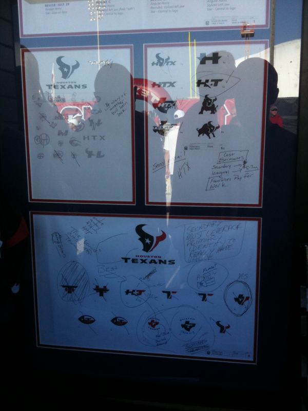
the one you used was actually a fan made design, probably based on the original concept that never made it to the final stage.. http://boards.sportslogos.net/topic/88736-houston-texans-secondary-logo/page__hl__+texans++logo
GuerillaBlack
Hall of Fame
lol, nice detective work.
I've been playing around in photoshop and came up with this. What do y'all think?
[IMGwidthsize=25]http://i446.photobucket.com/albums/qq185/Andew6/texansbullrend.jpg[/IMG]
[IMGwidthsize=10]http://i446.photobucket.com/albums/qq185/Andew6/texansbullrend.jpg[/IMG]
[IMGwidthsize=50]http://i446.photobucket.com/albums/qq185/Andew6/texansbullrend.jpg[/IMG]
[IMGwidthsize=100]http://i446.photobucket.com/albums/qq185/Andew6/texansbullrend.jpg[/IMG]
IMGwidthsize=10]http://i446.photobucket.com/albums/qq185/Andew6/texansbullrend.jpg[/IMGwidthsize
Personally, I don't like it. Everyone else who had a logo redesign went with a more "aggresive" look. I don't think this does that for us.
Think about the Dolphins new logo.... used to be comedic, now it's fierce.


Showtime100
Got JJ?
I like this one...

